Market Profile ®
What is a Market Profile?
A Market Profile® (also known as “Time Price Opportunity” or “TPO”) is a graphical representation of market prices.
It consists of boxes representing the levels reached by the price of a financial instrument over a given period (usually 30 minutes per box).
Stacking these boxes allows to identify significant price levels, including those that have been most frequently reached by the market and those that have been reached the least.
Each profile generally corresponds to 1 trading day.
It is often displayed alongside a Volume Profile, representing the total volumes executed at each price level.
This representation is often considered richer than traditional candlesticks because it allows for more direct visualization of:
- the price levels visited the most by the market and those that were visited the least,
- the price levels that have been tested for a long time by the market without being crossed,
- the price levels that have not been tested for long by the market.
The components of a Market Profile
A Market Profile generally includes the following elements:
- the time-price profile, consisting of boxes representing price movements,
- the Point Of Control (POC), corresponding to the levels at which the market price remained the longest,
- the Value Area (VA), where the market price has remained most of the time (generally 70% of the profile),
- the Volume Profile, representing the total volumes executed at each price level.
Via the ProRealTime Complete and ProRealTime Premium platforms, you can also:
- display the Initial Balance (IB) to quickly identify price movements at market open,
- draw extensions for Singles,
- detect Poor Highs and Poor Lows,
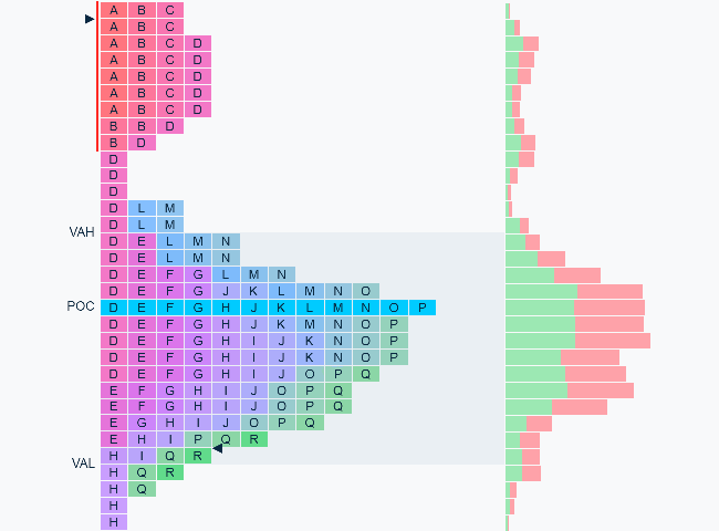
Boxes
Each box represents a price range reached on a given period.
Unlike traditional candlesticks, Market Profile boxes have a fixed height: if the price changes rapidly, several boxes will be plotted for the same period.
Each period is identified by a different letter (A = first 30 minutes of the day, B = next 30 minutes, etc...).
 price
candlestick
box
price
candlestick
box
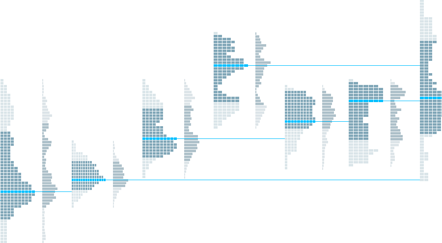
Building the profile
By default, letters are grouped: boxes corresponding to the same price range are stacked.
This representation allows you to quickly identify where the market remained the longest and which price levels were visited the least.
You can group/ungroup the letters of each profile individually by right-clicking on it, or check/uncheck the corresponding box in the indicator settings to group/ungroup all profiles displayed on the chart.

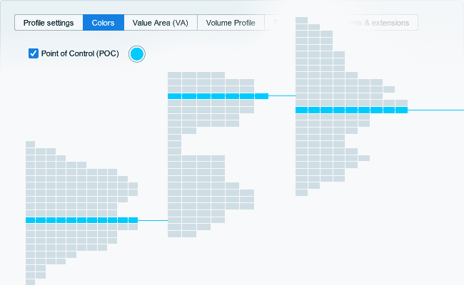
The Point of Control (POC)
The Point of Control corresponds to the price range that has the highest number of stacked boxes.
It allows you to identify the price range where the stock price has remained the longest.
The Value Area (VA)
The Value Area allows you to identify price levels that encompass the majority of boxes (generally 70%).
Like the POC, it allows you to quickly identify price ranges where the stock price has remained for most of the day.

The Volume Profile
The Volume Profile represents the total volumes traded in each price range.
It may therefore differ from the profile drawn by the boxes introduced above, which instead represent the time spent in these price ranges.

The Initial Balance
The Initial Balance corresponds to the first quotes for the profile, generally the first two periods (letters A and B, i.e., the first trading hour of the day).
It allows you to quickly identify the price levels reached immediately after the market opens.

Singles
Singles represent price ranges that have been crossed by the price on a single period without being revisited.
These levels can be interpreted as breaks after crossing support or resistance levels.

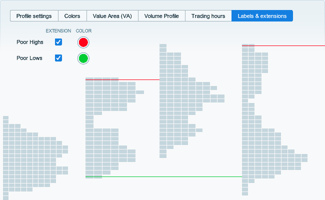
Poor Highs and Poor Lows
Poor Highs and Poor Lows correspond to situations where one end of the profile is covered by several boxes (either on the highest/lowest price zone, or on the one just below/above).
These levels help to identify potentially unfinished auctions at certain price levels, which may therefore represent support or resistance levels.
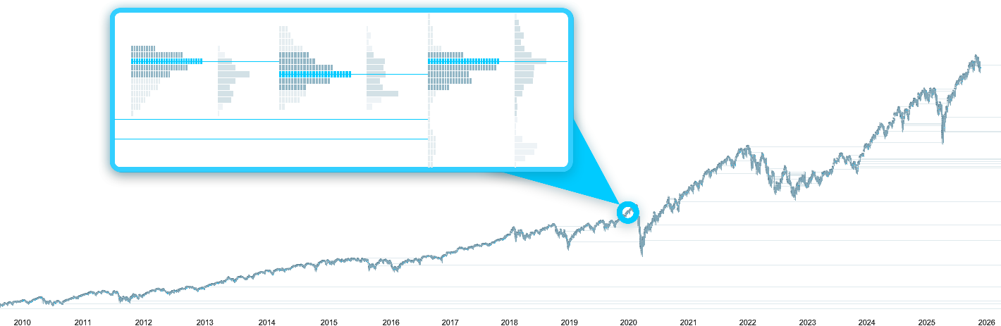
Analyze the Market Profile over several years
With ProRealTime, display up to 1 million historical candlesticks with the Premium version to analyze Market Profile signals over several years of intraday historical data.